
You are using an out of date browser. It may not display this or other websites correctly.
You should upgrade or use an alternative browser.
You should upgrade or use an alternative browser.
HipstaPaks New free film - Bream Pride
- Thread starter lkbside
- Start date
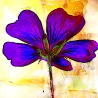
Oooh, I say, that’s colourful. What do you think of it? Will it be useful? Your images look lovely and I’m wondering how I’d use it.View attachment 110915 View attachment 110916 View attachment 110917 View attachment 110919 Shake it and the colors change. Slide left on the film for pastel shades.
sinnerjohn
IOTM WInner - April 2022
Maybe one for the completists out there......
It certainly makes the images pop! I’ll grab it up just cuz it’s Pride.  :rainbow:
:rainbow:- Real Name
- Rog...
- Device
- iPhone 13 Pro
Thanks Leslie, I must be slipping...View attachment 110914
Available in the Hipstamart today. You have to search for it, it doesn’t come up on the ‘featured’ page.
Just in time for Pride Month comes a rainbow colored version of Bream.

And who might they be John?...Maybe one for the completists out there......

I have, of course, already GETTID it...
Oooh, I say, that’s colourful. What do you think of it? Will it be useful? Your images look lovely and I’m wondering how I’d use it.
I reckon you’d take the Hipsta image and run it through decim8 or trigimator. or both. Twice.
sinnerjohn
IOTM WInner - April 2022
Thanks Leslie, I must be slipping...
And who might they be John?...
I have, of course, already GETTID it...
")
Oooh, I say, that’s colourful. What do you think of it? Will it be useful? Your images look lovely and I’m wondering how I’d use it.
I reckon you’d take the Hipsta image and run it through decim8 or trigimator. or both. Twice.
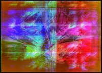
Here ya go, Jilly — simple as. A mere 47 or so steps (Decim8 & Trigraphy x 2, Pixlr x many, SnapSeed and back to Hipsta for a I forget which combo. And I must admit I cropped it a little in SnapSeed) and before you know it, a perfectly, er, acceptable colour abstract

Your turn
Attachments

Here ya go, Jilly — simple as. A mere 47 or so steps (Decim8 & Trigraphy x 2, Pixlr x many, SnapSeed and back to Hipsta for a I forget which combo. And I must admit I cropped it a little in SnapSeed) and before you know it, a perfectly, er, acceptable colour abstract
Your turn
View attachment 110987
View attachment 110986
View attachment 110985
 Gorgeous. Love them all. By the way, if you take the Bream frame off in Hipsta, it puts a colour overlay over the image. It uses the same colours as the frame. I used it in my 365 and I like it much better than the, dare I say, garish colours of the frames.
Last edited:
sinnerjohn
IOTM WInner - April 2022
You dare saydare I say, garish colours of the frames.
Seriously, what is the point of that great BIG garish frame

davegray
MobiLurver
- Real Name
- Dave Gray
- Device
- iPhone 14 Pro Max
To be differentYou dare say
Seriously, what is the point of that great BIG garish frame
 Don’t really like it myself but the whole point of Hipstamatic (IMHO) is it offers the opportunity to change the feel/atmosphere/mood of the original photo and I think it does a lot better than most other apps. I’m quite happy trying each new combo. Some work, some don’t, but I guess it depends on the original scene.
You are the Master of Hipstamatic Dave.To be different
 You do amazing things with your fantastic images and the app. Your images don’t really scream Hipstamatic. I would use Bream, but as an overlay, not with that frame. That coloured frame definitely shouts Hipsta.
Wow, these really suit the pak!
Yes, I hate those frames....
 I suppose someone creative can find some use for them though....
Yep. See what I mean??? (see previous post)
Fantastic Leslie.