
-
Nominations for the April Image of the Month (IotM) close at the end of the day on Tuesday, April 30. Get your four nominations in!
You are using an out of date browser. It may not display this or other websites correctly.
You should upgrade or use an alternative browser.
You should upgrade or use an alternative browser.
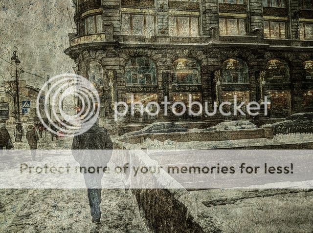
The House of Books - St Petersburg, Russia
- Thread starter Egraphic
- Start date
- Real Name
- Rog...
- Device
- iPhone 13 Pro
And in my humble opinion you seem to have managed to create the effect you were after exceedingly well... 
I really do like this style of iPhoneArt, it just rocks...
One small niggle for me though, hope you don't mind if I mention, but it could do with a swift straighten as it seem titled over slightly to the left at the top...
Reckon it would impact even more with vertical lines...
I really do like this style of iPhoneArt, it just rocks...
One small niggle for me though, hope you don't mind if I mention, but it could do with a swift straighten as it seem titled over slightly to the left at the top...
Reckon it would impact even more with vertical lines...
Dakini Goddess
MobiStarlet
Egraphic said:... on a December day in the depths of the Russian winter - trying to recreate the bitter cold and dark dark skies.
Nice..Have you taken the image into painteresque?
- Real Name
- Richard
- Device
- iPhone 12 Pro
And I would say job done - and done very well!... on a December day in the depths of the Russian winter - trying to recreate the bitter cold and dark dark skies.
I'm assuming that's a book shop in the background. Looks interesting. Hope it's still thriving.
Thanks! Shot with the standard camera, contrast and color pumped up in Photogene2 and PhotoWizard, copy made and processed in Painteresque, copy superimposed over original in DXP and adjusted to taste, Grunge and Grungetastic to darken stuff up, and a custom texture (peeling paint) applied in PhotoWizard, blended using Multiply.Well done! What apps did you use?
And I would say job done - and done very well!
I'm assuming that's a book shop in the background. Looks interesting. Hope it's still thriving.
Thanks! Yes, that's a very large bookshop in St Petersburg, Russia, and it's certainly thriving. It's the biggest bookstore in the city. I was last there 35 years ago (when it was still Leningrad) as a grad student. Returned for the first time last December. Not much had changed in the bookstore, except that the cafe is better run and cares what customers think. Outside the bookstore, a different story. Some pretty incredible wealth accumulated in this not-so-democratic country now.
Thank you! See the comment above for the process, as far as I remember it. Painteresque was one step, but I generally don't care for the "full effect" - you can't adjust it. I use DXP to "adjust" it by using different combination modes when superimposed over the original.Nice..Have you taken the image into painteresque?
And in my humble opinion you seem to have managed to create the effect you were after exceedingly well...
I really do like this style of iPhoneArt, it just rocks...
One small niggle for me though, hope you don't mind if I mention, but it could do with a swift straighten as it seem titled over slightly to the left at the top...
Reckon it would impact even more with vertical lines...
Thanks, Venomator! Sure, I welcome suggestions/recommendations - let me take a look.