Just layers in Procreate, a few brushes, also SuperImpose. I think Impresso may have been involved. It was one of those following where the image took me things. Here are my layers in both. Looking at them I may not have used the Procreate one.And I love your imageWow. Do tell...? (No trade secrets here, out with it. I must warn you, though - @dscheff’s method of ‘capturing paint and other splatters on the props room floor’ will be hard to top
)
-
Nominations for the April Image of the Month (IotM) close at the end of the day on Tuesday, April 30. Get your four nominations in!
You are using an out of date browser. It may not display this or other websites correctly.
You should upgrade or use an alternative browser.
You should upgrade or use an alternative browser.
APPstract RESULT: 2Weekly APPstract Challenge #9 Abstract Your Way
- Thread starter zenjenny
- Start date
Stripes (or perhaps Gastritis )
Assembly,SuperimposeX, Ultrapop, Mystic, Darkroom (and maybe iColorama, I have so many iterations I forget what went into this.)

Assembly,SuperimposeX, Ultrapop, Mystic, Darkroom (and maybe iColorama, I have so many iterations I forget what went into this.)
Last edited:
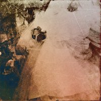
This is a fragment of an image Karl (remember Karl?) let me mess around with years ago. What said ‘abstract’ for me, JillyG , thank you for the theme, are the deep lines — of grief? pain? something else? etched in the woman’s face.
Picasso says first strip away the reality (or something). I wanted the lines to tell their own story (ie ‘not representational’.
I got quite frustrated with this one, too — similarly to the ‘plan an abstract’ challenge. There was some interesting discussion in that challenge about intentional vs accidental or serendipitous meanings. Looking over the 49 saved versions of this image, I wonder if my increasingly frustrated focus on the kind of look I envisaged (which, btw, did not arise) had me ignoring some potentially interesting sidetracks.
Edit: SnapSeed Hipsta Pixlr Repix SketchClub Shift Formulas
Last edited:
Stripes (or perhaps Gastritis )
SuperimposeX, Ultrapop, Mystic, Darkroom (and maybe iColorama, I have so many iterations I forget what went into this.)
View attachment 122251
Lovely palette. And if I ignore the title I really enjoy the interaction of shapes! Btw, first time it’s occurred to me that a simplified stomach looks like a Picasso dove!
Have you ever explored “eye travel” as a means to exploring an image? It is quite useful when studying composition. Your eyes at this level operate directly connected to the primitive part of the brain, much faster that the thinking part of the brain. Which means, the thinking part of the brain is not directing eye travel, until much later.
This is a fragment of an image Karl (remember Karl?) let me mess around with years ago. What said ‘abstract’ for me, JillyG , thank you for the theme, are the deep lines — of grief? pain? something else? etched in the woman’s face.
Picasso says first strip away the reality (or something). I wanted the lines to tell their own story (ie ‘not representational’.
I got quite frustrated with this one, too — similarly to the ‘plan an abstract’ challenge. There was some interesting discussion in that challenge about intentional vs accidental or serendipitous meanings. Looking over the 49 saved versions of this image, I wonder if my increasingly frustrated focus on the kind of look I envisaged (which, btw, did not arise) had me ignoring some potentially interesting sidetracks.
Edit: SnapSeed Hipsta Pixlr Repix SketchClub Shift Formulas
When an image first pops up you pay attention to what your eyes are doing. What it the first thing your eyes latch onto? The second? Third? When studying a composition I’m interested in seeing if the leading lines are successful in directing the viewer’s eye into the image and being directed towards the focal point, and not being guided directly out of the frame.
In this case I was curious to see what is the first thing that catches my eye. It turns out to be the eye because of the dark eyeglass frame making a target out of it. Not the eye itself but the eyeglass frame and eye together.
Next it is the dark rotational arrowhead under the chin/cheek. Third, the dark mouth. The dark areas stand out because of their contrast with the overall image and the amount of visual mass they have. The eye, more because of the graphic combination of eye and frame and the overall area it occupies. It all happens very fast. I think it would not matter if the image was a straight photograph or an abstracted image.
The point of this is that so far I still have not got to studying the expression or the lines etched on the face since they are more subtle that the first three. And I am wondering if this is why you were feeling frustrated in directing attention to the part of the image you felt was most important to you.
I’m intrigued by the face that immediately presents itself in the image. The blue circle in the upper right becoming the 2nd eye. There’s the curved blue cheek line in lower left. And the lower lip of the mouth in cyan. All well placed in good proportions.Stripes (or perhaps Gastritis )
SuperimposeX, Ultrapop, Mystic, Darkroom (and maybe iColorama, I have so many iterations I forget what went into this.)
View attachment 122251
I didn’t see the face until you pointed it out. I did place the objects on the “canvas” - perhaps it’s my subconscious at work.I’m intrigued by the face that immediately presents itself in the image. The blue circle in the upper right becoming the 2nd eye. There’s the curved blue cheek line in lower left. And the lower lip of the mouth in cyan. All well placed in good proportions.
Have you ever explored “eye travel” as a means to exploring an image? It is quite useful when studying composition. Your eyes at this level operate directly connected to the primitive part of the brain, much faster that the thinking part of the brain. Which means, the thinking part of the brain is not directing eye travel, until much later.
When an image first pops up you pay attention to what your eyes are doing. What it the first thing your eyes latch onto? The second? Third? When studying a composition I’m interested in seeing if the leading lines are successful in directing the viewer’s eye into the image and being directed towards the focal point, and not being guided directly out of the frame.
In this case I was curious to see what is the first thing that catches my eye. It turns out to be the eye because of the dark eyeglass frame making a target out of it. Not the eye itself but the eyeglass frame and eye together.
Next it is the dark rotational arrowhead under the chin/cheek. Third, the dark mouth. The dark areas stand out because of their contrast with the overall image and the amount of visual mass they have. The eye, more because of the graphic combination of eye and frame and the overall area it occupies. It all happens very fast. I think it would not matter if the image was a straight photograph or an abstracted image.
The point of this is that so far I still have not got to studying the expression or the lines etched on the face since they are more subtle that the first three. And I am wondering if this is why you were feeling frustrated in directing attention to the part of the image you felt was most important to you.
No I haven’t, and thank you. Makes sense that I might feel frustrated because my composition I’d doing the opposite of my So, I’ll do a version with the eyeglasses lightened and see what I think.
Funny, bcs the black of the glasses, mouth and facial lines spoke to me as a combination. Maybe what I really intended was something else altogether

I didn’t see the face until you pointed it out. I did place the objects on the “canvas” - perhaps it’s my subconscious at work.
I’d like to see that ‘Freudian analysis of an image’ paper !
I was going to title this "Dance of the Mushrooms" in homage to Fantasia, but after staring at it a while longer, I've decided to call it "Tomato and mushroom soup with shallots and garlic." It's another Microsoft Pix piece with help from iColorama. I wanted it to look like something but not the something it started as (see attached).
Attachments
Approaching the multi-dimensional planet Zebulon 6.

The original picture was made accidentally while bending down to make a picture with aremaC.
Edited a bit in Affinity Photo, and then Imaengine (about 25 versions) and then back to aremaC. Once I could see what aremaC was doing to the Imaengine result I went back to Imaengine and tweaked it some more to get more of one thing and less of another. Back to aremaC, twice, through 2 different effects. I also tried switching the order of the last steps and preferred one result over the other. I was pleased to see several vague face profiles appearing along the green edges. I also really like the depth created by the apparent layers.
Below is the original picture, which is sort of interesting, too.

While bending down to make a picture with aremaC I accidentally touched the wrong part of the screen changing the preset and tripping the shutter.
The preset has some horizontal smearing at both sides but that doesn’t account for the amount so camera motion must have helped it along. The preset also caused the weird colours. I think it is mostly out of focus clouds reflected in a puddle. When I took a closer look at the camera and I could see I had accidentally switched presets so I selected the right one and carried on.
The original picture was made accidentally while bending down to make a picture with aremaC.
Edited a bit in Affinity Photo, and then Imaengine (about 25 versions) and then back to aremaC. Once I could see what aremaC was doing to the Imaengine result I went back to Imaengine and tweaked it some more to get more of one thing and less of another. Back to aremaC, twice, through 2 different effects. I also tried switching the order of the last steps and preferred one result over the other. I was pleased to see several vague face profiles appearing along the green edges. I also really like the depth created by the apparent layers.
Below is the original picture, which is sort of interesting, too.
While bending down to make a picture with aremaC I accidentally touched the wrong part of the screen changing the preset and tripping the shutter.
The preset has some horizontal smearing at both sides but that doesn’t account for the amount so camera motion must have helped it along. The preset also caused the weird colours. I think it is mostly out of focus clouds reflected in a puddle. When I took a closer look at the camera and I could see I had accidentally switched presets so I selected the right one and carried on.
I’m really loving these images you’re creating with Microsoft Pix.View attachment 122287
I was going to title this "Dance of the Mushrooms" in homage to Fantasia, but after staring at it a while longer, I've decided to call it "Tomato and mushroom soup with shallots and garlic." It's another Microsoft Pix piece with help from iColorama. I wanted it to look like something but not the something it started as (see attached).
View attachment 122287
. I wanted it to look like something but not the something it started as (see attached).
Clearly you have succeeded admirably

")
And what is this app ? Microsoft Pix? And why is it not in the Au store?
As yet untitled. Unfinished , too - but 137 (true) versions say please stop’
an earlier version

I don’t know how you get such a lovely image from Microsoft Pix (even with help from iC). I downloaded it and I don’t like any of the presets AND the Microsoft Pix logo features on every image!!View attachment 122287
I was going to title this "Dance of the Mushrooms" in homage to Fantasia, but after staring at it a while longer, I've decided to call it "Tomato and mushroom soup with shallots and garlic." It's another Microsoft Pix piece with help from iColorama. I wanted it to look like something but not the something it started as (see attached).

I don’t know what Ted does but the workflow isn’t difficult. You can stop the “painting “ process just by tapping on the slider line at the bottom and then you can drag the slider in either direction until you achieve a result you like. As for the logo I either crop or clone stamp it out.I don’t know how you get such a lovely image from Microsoft Pix (even with help from iC). I downloaded it and I don’t like any of the presets AND the Microsoft Pix logo features on every image!!
I do just what deepop said. All of mine were done using the Petals preset and then pulling the slider back to somewhere around the 1/4 mark.I don’t know how you get such a lovely image from Microsoft Pix (even with help from iC). I downloaded it and I don’t like any of the presets AND the Microsoft Pix logo features on every image!!
You're sure this is an earlier version of the fiery lady above? Amazingan earlier version

I think we passed through there on a road trip in college.Approaching the multi-dimensional planet Zebulon 6.

Ohhhhhhh, I thought that was some sort of video thingy. Thank you David. I can see how it works now.I don’t know what Ted does but the workflow isn’t difficult. You can stop the “painting “ process just by tapping on the slider line at the bottom and then you can drag the slider in either direction until you achieve a result you like. As for the logo I either crop or clone stamp it out.
That could happen if the car was full of “smoke”I think we passed through there on a road trip in college.

Thank you Ted. I see where I’ve been going wrong.I do just what deepop said. All of mine were done using the Petals preset and then pulling the slider back to somewhere around the 1/4 mark.

Car? Hmm... No, I don't remember driving.That could happen if the car was full of “smoke”
Who goes there?

‘Abstract’ for me because I see something different at each rotation.
An old reworked Dubble.anearlierversion below(can you see in this one what the main image is?)
This one edited with Hipsta,Decim8 and everything in between.
‘Abstract’ for me because I see something different at each rotation.
An old reworked Dubble.anearlierversion below(can you see in this one what the main image is?)
This one edited with Hipsta,Decim8 and everything in between.