Totes. Me Too. Doesn’t the third one have circles in it?Totally love this. Would have this on my wall.

Nominations for the April Image of the Month (IotM) close at the end of the day on Tuesday, April 30. Get your four nominations in!
Totes. Me Too. Doesn’t the third one have circles in it?Totally love this. Would have this on my wall.
What she said!!!!Totally love this. Would have this on my wall.
And the brave little cactus was only a couple of feet high!
 . Also, the blue one is one of my favourite all time Hodge images
After I posted it, I started musing about when I'd use the tool and when not. I realized I have two shooting modes* -- documentary and arty. If I'd been in documentary mode, just wanting to show what was there, I not only wouldn't have used the line removal tool but also would have backed up a few steps when I took the picture. But I was in arty mode, wanting to get a dramatic perspective on the skeleton, so the ropes were just in the way.magic indeed
Totally love this. Would have this on my wall.
Totes. Me Too. Doesn’t the third one have circles in it?
What she said!!!!
Thanks to you all. I'd been meaning for some time to use the two outside ones in a triptych but didn't have any inspiration for the third. Then I realized I already had the thirdWhat Jilly & Star said
and stuck it in the middle.I like this and interesting to see its origins.View attachment 158171
Early work of a modernist speed freak with an interest in botany
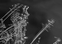
This incoherent image started as a failed focus stack, with 20 shots taken in CameraPixels and merged in Affinity Photo. I shot it handheld, and most of it aligned well, but one section had too much stray movement due to a light breeze. I cropped down to that section and started played with it, converting to b/w in Photos, making edits in Snapseed and ACDSee Pro, and cleaning up some stray bits in TouchRetouch. The image was small because of the original cropping, so I up-rezed it in Big Photo and then took it into iColorama for Coherence/1 in order to smooth out the edges. While I was there, I made some other changes, including Style/Edges and Effects/Glow and probably a few other things. After iColorama, I went to Graphite, which provided the sketchy, angular look and the busy patterned background.
If you want to know why I chose to work on the failed section of the original instead of the rest, all I can say is it looked more interesting.
If you're interested, I've attached the original photo and an intermediate stage where I almost stopped.
I just love this! Gotta check out that video.....View attachment 158323
Another attempt to approach impressionism, this time by a different route. I took 5 images of this cabin at Wilder Ranch, each with slight camera movement. I layered them in Affinity Photo using the New Stack option and then set the stack type to Median to get the starting mix. After that, I used ACDSee Pro to play with the colors a bit.
I love the end result but the intermediate is fab!View attachment 158171
Early work of a modernist speed freak with an interest in botany
This incoherent image started as a failed focus stack, with 20 shots taken in CameraPixels and merged in Affinity Photo. I shot it handheld, and most of it aligned well, but one section had too much stray movement due to a light breeze. I cropped down to that section and started played with it, converting to b/w in Photos, making edits in Snapseed and ACDSee Pro, and cleaning up some stray bits in TouchRetouch. The image was small because of the original cropping, so I up-rezed it in Big Photo and then took it into iColorama for Coherence/1 in order to smooth out the edges. While I was there, I made some other changes, including Style/Edges and Effects/Glow and probably a few other things. After iColorama, I went to Graphite, which provided the sketchy, angular look and the busy patterned background.
If you want to know why I chose to work on the failed section of the original instead of the rest, all I can say is it looked more interesting.
If you're interested, I've attached the original photo and an intermediate stage where I almost stopped.
I love the end result but the intermediate is fab!
I was torn between the two. I think I ended up putting the Graphite version in the main spot because I'd done more work on it, which is probably not the best way to choose. Thanks! I feel like I'm inching along a bit at a time. The video, you can see, is part 3 of his workflow series. I did watch 1 & 2, but there's no need to bother. Part 1 is him shooting at the beach and once you see how he waves the camera around, there's nothing else to see. Part 2 is just him reviewing his photos in Lightroom and selecting ones to use in part 3, but it doesn't tell you anything about why he's choosing the ones he does.I just love this! Gotta check out that video.....
Thanks for the link to his YouTube anyways. I think I already know Andy Gray as a photographer. I bought quite a few copies of Outdoor Photographer magazine during 2018/19 and they often feature abstract photographers. Will have to rifle through and see. I sometimes bought the online version from Pocketmags and back issues but I never read them as thoroughly as the physical ones. I had to stop myself just swiping through rather than studying each page which I did with the magazine in my hand.Thanks! I feel like I'm inching along a bit at a time. The video, you can see, is part 3 of his workflow series. I did watch 1 & 2, but there's no need to bother. Part 1 is him shooting at the beach and once you see how he waves the camera around, there's nothing else to see. Part 2 is just him reviewing his photos in Lightroom and selecting ones to use in part 3, but it doesn't tell you anything about why he's choosing the ones he does.
Don’t make me dive into Affinity Photo again!!!View attachment 158323
Another attempt to approach impressionism, this time by a different route. I took 5 images of this cabin at Wilder Ranch, each with slight camera movement. I layered them in Affinity Photo using the New Stack option and then set the stack type to Median to get the starting mix. After that, I used ACDSee Pro to play with the colors a bit.
Well, you could use Affinity Photo just for creating and arranging the stack, and then export to work on it with other apps.Don’t make me dive into Affinity Photo again!!!
Just looked at Andy and David's IG's. I like what I see and I see they both tag intentional camera movement. I guess I'll have to look at the video and see how much they stack/layer etc, tbh I'm just too lazy to do so much faffing. Looked at Roxanne's work as well and hmmmIf you look at the Instagram feeds I mentioned above for Andy Gray and David Howell, you'll see that they're very similar (to each other and from one image to another). Just yesterday, I stumbled on Roxanne Overton's Instagram feed, which I found very exciting because she uses the same techniques -- camera motion, blur, stacks, and similar -- yet produces very different results. Wow!
lets just say I'm sure Jen would love it !You might also like Syed Uzair then as well. He's another one I follow for ICM/impressionist stuff. I don't love absolutely all of Overton's images, but I find a lot of them have real punch for me. A good example is the one of houseboats in Sausalito that is right near the top of her feed at the moment. (Sausalito is just north of San Francisco, by the north end of the Golden Gate Bridge. It's been well-known for years for its collection of creatively ramshackle houseboats and bohemian atmosphere.) She's using the same tools, more or less, but ending up with clean, strong lines and much bolder colors, a different vision of how to put multiple shots together.Just looked at Andy and David's IG's. I like what I see and I see they both tag intentional camera movement. I guess I'll have to look at the video and see how much they stack/layer etc, tbh I'm just too lazy to do so much faffing. Looked at Roxanne's work as well and hmmm
Now we are talking. Yes, her work opens up the possibilities. I like some of her stuff but not all.If you look at the Instagram feeds I mentioned above for Andy Gray and David Howell, you'll see that they're very similar (to each other and from one image to another). Just yesterday, I stumbled on Roxanne Overton's Instagram feed, which I found very exciting because she uses the same techniques -- camera motion, blur, stacks, and similar -- yet produces very different results. Wow!
I checked out your recommendations. I followed them all except Syed Uzair. I wasn’t able to figure out which one he was on the search.You might also like Syed Uzair then as well. He's another one I follow for ICM/impressionist stuff. I don't love absolutely all of Overton's images, but I find a lot of them have real punch for me. A good example is the one of houseboats in Sausalito that is right near the top of her feed at the moment. (Sausalito is just north of San Francisco, by the north end of the Golden Gate Bridge. It's been well-known for years for its collection of creatively ramshackle houseboats and bohemian atmosphere.) She's using the same tools, more or less, but ending up with clean, strong lines and much bolder colors, a different vision of how to put multiple shots together.