juryjone
MobiLurver
- Real Name
- Jerry Jobe
- Device
- iPhone 12 Pro Max
Is Jerry universal?
I'm actually iOS dependent. No idea if Android apps work similarly. [emoji3]
Nominations for the April Image of the Month (IotM) close at the end of the day on Tuesday, April 30. Get your four nominations in!
Is Jerry universal?
What makes you think he has done most of this in IC?Just started using iColorama, would love to produce something like this guys does
http://instagram.com/odinvadim
Great work
It looks like firstly you have to start with a cracking (goodJust started using iColorama, would love to produce something like this guys does
http://instagram.com/odinvadim
Great work
") ) photo. Does it say somewhere that he uses iColorama for his images?
) photo. Does it say somewhere that he uses iColorama for his images?What makes you think he has done most of this in IC?
Interesting. I think he probably uses the Snapseed Details before he applies any IC brushes to make it that sharp and maybe he has his own textures which he applies.He told me he uses Snapseed and IC
Interesting. I think he probably uses the Snapseed Details before he applies any IC brushes to make it that sharp and maybe he has his own textures which he applies.

As close as I can get
I don't know about close to the other guy's work (lovely as it is), but this is beautiful in its own right, Chris. Is this your first 'painted' image/post?
Absolutely.Either way he produces some stunning work
Who is our iColorama expert?
This is the closest I get to what he has done although looking again at his photos perhaps too intense and he probably used more Flow or Coherence. With a bit more playing and studying his photos I could get closer:
View attachment 85650
In this second one the saturation is turned down a bit using Adjust>Saturation
View attachment 85651
I had another go and this next one is perhaps closer. It has less Ambiance and Structure and more Coherence>1 as well as one of my own textures.
View attachment 85653
So in Snapseed I applied full Ambiance and full Structure. For a less intense look I would tone these two down. In IC he has clearly used either one of the Style>Flow or Coherence options but at a 50% or less opacity to get that soft flowing look and he may well brush mask out some of this in the foreground. I am not sure whether he doe this before or after applying a Texture>Paper. In the example above I used Paper No. 5 beforehand. After this I applied Texture>Vintage>67 at a lower opacity. From here you can use Adjust>Exposure and Adjust>Vibrance to improve contrast, brightness, exposure and saturation.
Instead of using Structure in Snapseed you can also use the first three options of Adjust>High to get sharper details. Adjust>Tonelab>3 is also good for adjusting contrast and colours.
I also think he is also blending his photos with his own textures, quite subtle ones.
This is the original:
View attachment 85652
That's what I just said...

This is the closest I get to what he has done although looking again at his photos perhaps too intense and he probably used more Flow or Coherence. With a bit more playing and studying his photos I could get closer:
View attachment 85650
In this second one the saturation is turned down a bit using Adjust>Saturation
View attachment 85651
I had another go and this next one is perhaps closer. It has less Ambiance and Structure and more Coherence>1 as well as one of my own textures.
View attachment 85653
So in Snapseed I applied full Ambiance and full Structure. For a less intense look I would tone these two down. In IC he has clearly used either one of the Style>Flow or Coherence options but at a 50% or less opacity to get that soft flowing look and he may well brush mask out some of this in the foreground. I am not sure whether he doe this before or after applying a Texture>Paper. In the example above I used Paper No. 5 beforehand. After this I applied Texture>Vintage>67 at a lower opacity. From here you can use Adjust>Exposure and Adjust>Vibrance to improve contrast, brightness, exposure and saturation.
Instead of using Structure in Snapseed you can also use the first three options of Adjust>High to get sharper details. Sometimes Adjust>Tonelab>3 is also good for adjusting contrast and colours.
I also think he is blending his photos with his own textures, quite subtle ones.
This is the original:
View attachment 85652

She is.
Ma'am, you are a genius
 But look what you've produced. This is fab.
Ma'am, you are a genius
Oh yes, more understated and painterly. Nice!
Ma'am, you are a genius
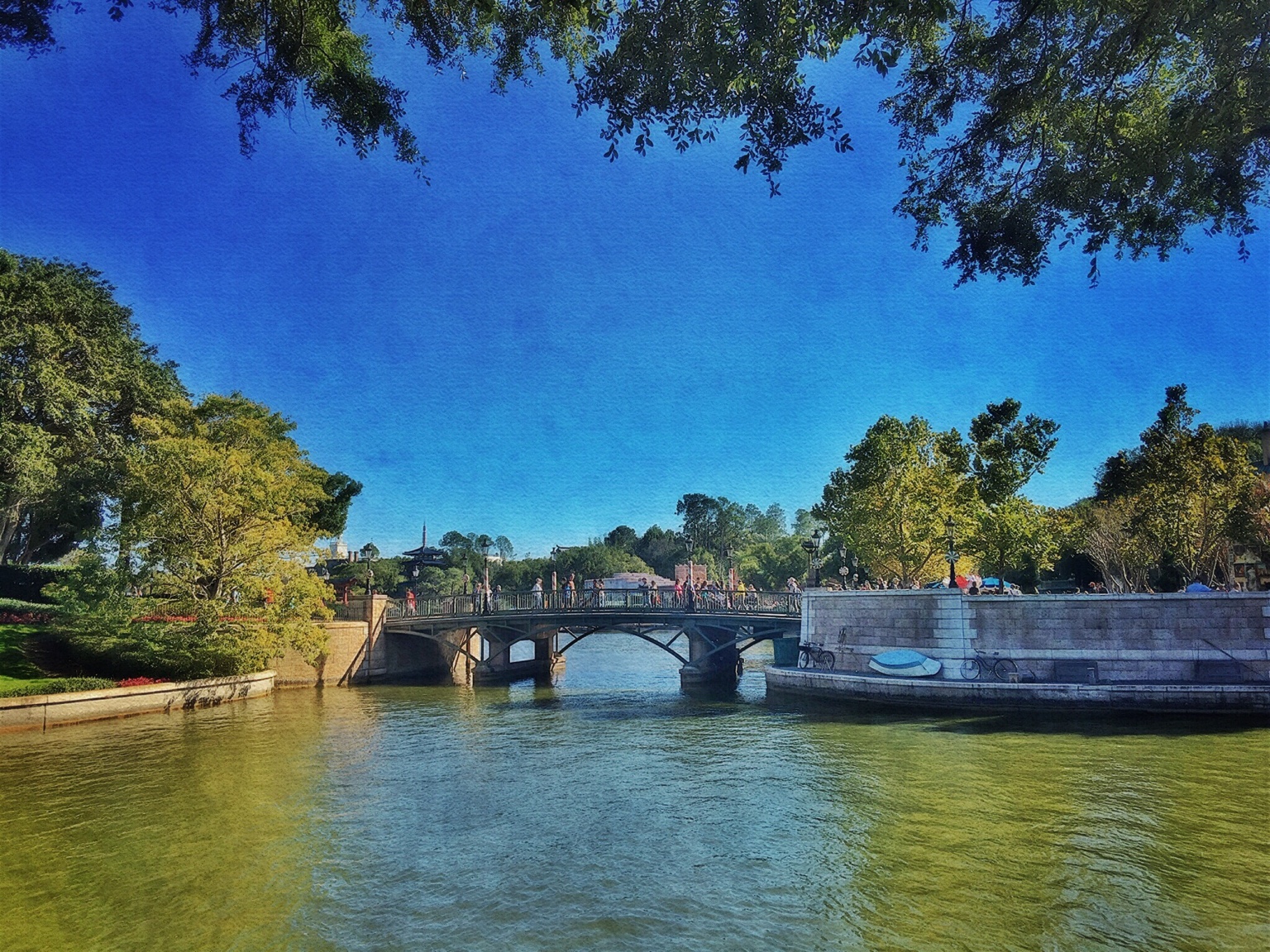
Great scene. Think I would prefer it without the border, Jerry. I find it a bit distracting from the lovely scene inside.Using Ann/ImageArt's recommendations, I produced this. Had my own texture to add, then added Water 1 at .3, then masked Border 7.
Great scene. Think I would prefer it without the border, Jerry. I find it a bit distracting from the lovely scene inside.